7. Letter Styles
Letter styles tell Cinecred how to draw and decorate text. You create these styles in the styling panel, and then assign them to content styles. Additionally, it is possible to directly assign them to portions of text in the spreadsheet. This article explains the configuration options of a letter style.
Don’t worry about being able changing the font size later on. All settings will automatically be scaled to the new size so that the text appears the same as before, just larger or smaller.
Name
Like all other styles, letter styles have a unique name. It is used to reference them both from content styles and directly from within the spreadsheet.

Font
This setting specifies the font family and font face. Cinecred ships with a collection of fonts that are well-suited for credits. Alternatively, custom fonts can be placed in the project folder; they then appear in this menu as well.
It’s also possible to choose any font installed on the system, though this is discouraged as your colleagues might not have the same fonts installed when you share the project with them.

Variations
Some fonts support variation axes, which can be smoothly adjusted to produce a font with the exact properties you want.
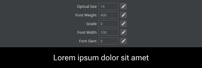
Height
In Cinecred, font size is given as height in pixels, and not as point size like in other programs. This enables uniform and pixel-perfect vertical layouts.

Leading
Sometimes, the font designer didn’t vertically center his font even though you require it, or you find the line spacing to small or too large. In such cases, empty space can be added (or even removed) above or below the text. The height of the text box remains the same, but the font size will change and the text will shift to reflect the added or removed empty space.

Tracking
This setting increases or decreases the spacing between individual letters. You may want to look into disabling Kerning and Ligatures if you substantially adjust the tracking, as these features are tailored to the tracking expected by the font designer.
Kerning
If all letters were spaced uniformly, certain sequences of letters like Ta would appear too loosely spaced. Kerning is a feature provided by most fonts that compresses the spacing between such pairs of letters.
Under the hood, this setting toggles the kern OpenType feature.

Ligatures
Some sequences of letters like ffi can look weird, so many fonts substitute them with special depictions called ligatures.
Under the hood, this setting toggles the liga and clig OpenType features.

Uppercase
If the text should be in uppercase, it’s best to just enable this setting instead of manually entering all caps text into the spreadsheet. This gives you the flexibility to change your mind later on.
Some portions like nobiliary particles should usually be exempted. When the Exceptions option is enabled, the project-wide Uppercase Exceptions apply, which by default contain all common nobiliary particles.
Some fonts provide different letter spacing for all caps text. The Spacing option switches to this spacing. Under the hood, it toggles the cpsp OpenType feature.

Small Caps
This setting converts all lowercase letters to shrunken versions of the corresponding uppercase letters. Both the small caps variant and the less common petite caps variant can be enabled.
Under the hood, this setting toggles the smcp or pcap OpenType feature. If small respectively petite caps are not supported by the font, they are emulated by shrinking regular uppercase letters.

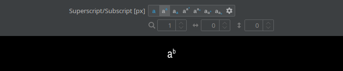
Superscript/Subscript
This setting scales and positions the text as superscript or subscript as defined by the font. Second level super/subscript is also available, for example:
abc
In rare cases, if the font-provided superscript and subscript is not satisfactory, the Custom option allows to manually scale and shift the text to achieve better positioning.
Under the hood, this setting does not use the sups and subs OpenType features. If the font supports them, and they cover all the letters you need, you can however enable them manually instead of using this setting.
Horizontal Scaling
This setting horizontally squishes or stretches the text. Be aware that excessive scaling deviates from what the designer imagined, and hence could make the text less readable.

OpenType Features
Modern OpenType fonts offer a plethora of additional features. The most important ones are controlled by explicit letter style settings. All others can manually be enabled with this setting.
The set of offered features depends on the font. For documentation on each feature and its permissible values, visit the registered features list.

Layers
All settings introduced so far only control the selection and sizing of letters, but not their coloring, background, underline, and other visual properties. That is done by a stack of so-called layers. Proceed to the following article for more information: