6.1. Grid Layout
The grid body layout arranges the body cells in a 2-dimensional grid. It should be used any time you want a fixed number of columns. It’s also the simplest choice when the body is expected to always have just a single cell.

Sort
This setting sorts the body cells in alphabetical order.

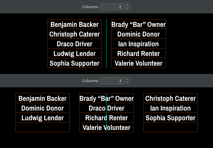
Columns
This setting defines the number of columns in the grid.
Filling Order
By default, the body cells fill the first row from left two right, then continue with the second row, and so on. You can change this filling order to right-to-left. And you can even completely fill the leftmost or rightmost column before continuing with the next column.

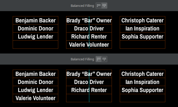
Balanced Filling
If the number of body cells doesn’t perfectly fill the grid, the cells in the last row are centered by default. This is more visually pleasant than if the cells were off to one side. If need be, you can of course disable this behavior.
Grid Structure
By default, the columns shrink to their minimum possible widths. For many designs however, it makes sense to have all columns share the same width to achieve visual uniformity. As a third option, you can even force all grid cells to be square, which can sometimes be useful for logos.

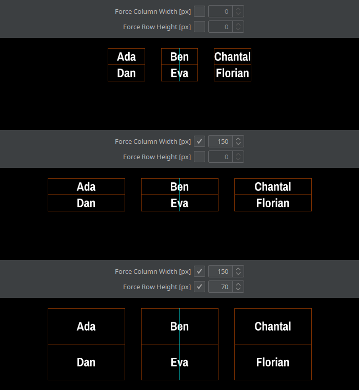
Force Column Width/Row Height
This setting forces all columns or rows to have a certain, manually specified width or height.
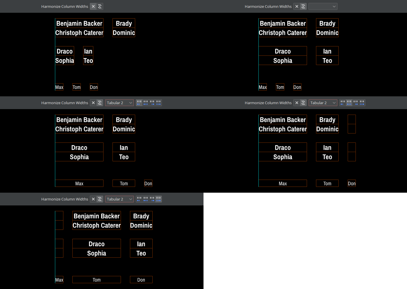
Harmonize Column Widths
This setting enforces for each column individually that it has the same width in all grids. By default, this setting only affects blocks of the same content style, but can be broadened to include other content styles.
If one of those other styles has more columns than this style, one can choose whether to harmonize this style’s columns with the leftmost or rightmost columns of the other style. It’s also possible to insert empty ghost cells for the missing columns, which can help with alignment.
To break the enforcement at some point, use the @Break Harmonization spreadsheet column.
Harmonize Row Height
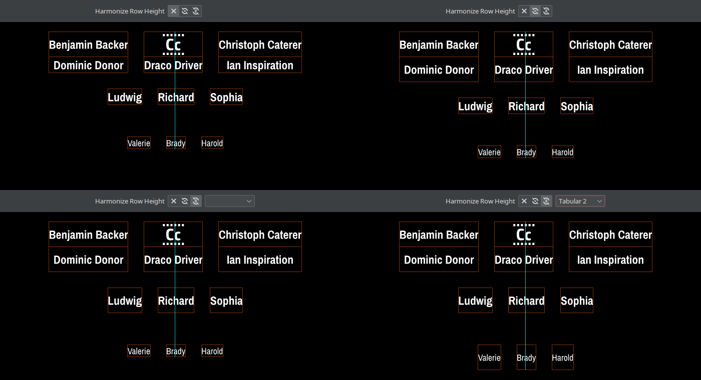
This setting forces all rows to have the same height. The first option only affects cells inside the same block. The second option affects cells across all blocks with the same content style. This can be further broadened to include other content styles.
To break the enforcement at some point, use the @Break Harmonization spreadsheet column.
Horizontally Justify Cells per Column
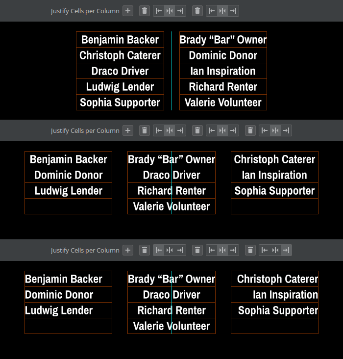
This setting controls for each column whether its content should be justified left, centered, or justified right.
Vertically Justify Cells/Text
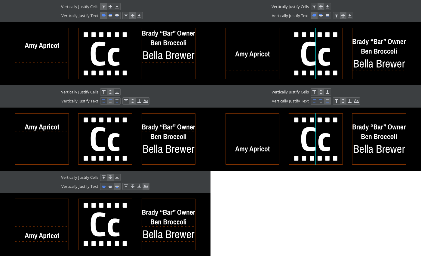
Sometimes, a row is taller than a cell’s content, for example when text cells have different numbers of lines, when text has different font sizes, when combining text and images, or when using square cells. In such cases, these settings specify how the cells’ content should be aligned.
Fundamentally, Vertically Justify Cells controls whether the content should be justified top, centered, or justified bottom.
Text cells are special though: they establish their own vertical justification region, which is marked by the dashed guide lines. The right buttons of Vertically Justify Text then decide whether the text should be justified top/middle/bottom within this region, or whether baselines should be aligned. If the text consists of multiple lines, the left buttons can further decide that it’s the first or last lines that should be aligned across cells.
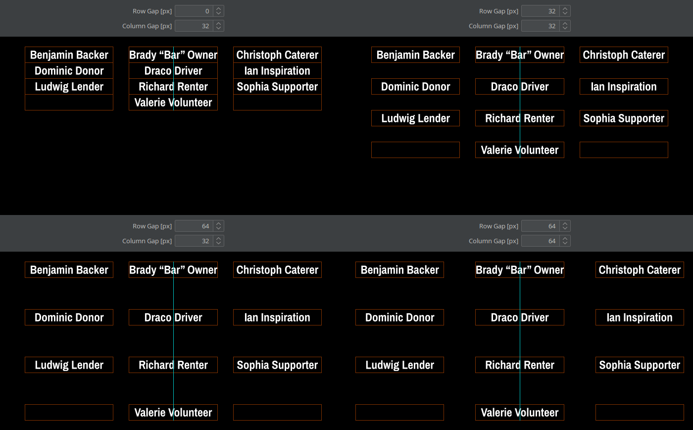
Row/Column Gap
This amount of blank pixels is inserted between rows respectively columns in the grid.